Creating a Consistent Brand for Localized Recruitment
Choosing to work abroad is a life-enriching adventure. Workwide Group aims to make this transition as easy as possible with their portfolio of brands that include localized job sites and recruitment services. The Brand Project was tasked with helping Workwide to communicate its core values and drive conversion across their local platforms by creating a clear and streamlined visual identity and functional web design.
Workwide Group is a recruitment technology company that offers access to the European multilingual talent pool. They operate nine and counting standalone job sites and Lingocruit, a recruitment agency division. Guided by their vision to remove national borders from the talent equation they now have helped hire more than 8,000 multilingual candidates since their start in 2014.
Visual brand identity
Digital design concepts
Web and application design
Visual brand asset development
Brand guidelines
Designing for consistency
The Workwide brand was developed in 2016 with an ambition to create localized sites and content for people aspiring to work and live abroad, but seek jobs in their native language. At the time, their strategy was to have each site heavily catered to its particular audience and as a result they each created their own visual identity.
As the company grew and more local sites were added, it became clear that they were lacking consistency and cohesiveness in the overall brand across these sites. Each local platform had their own color palette and modified logo somewhat diluting the main purpose and values of Workwide Group as a whole.
In order to build their brand equity, Workwide decided to start a process with The Brand Project’s design team to evaluate the different sites and identities. The purpose was to create brand consistency and at the same time improve the user experience, organize educational content across the platforms, and to drive conversions for each local site.
One identity, 9 sites (and counting)
After a series of strategic sessions working closely with Workwide, it was decided that in order to gain the maximum value of the brand and set Workwide up for future growth and scalability, only one identity would be created for each local site.
Since the local websites are also used as an educational tool for the job seekers, the identity and web design really needed to appear humane, trustworthy, empathetic, and relatable, but at the same time bold and ambitious. The Brand Project’s design team created the new visual identity consisting of Design Principles, a new logo, a color palette, typography, support elements, and brand guidelines for all visual usage.
The Design Principles were created to guide the visual identity and to keep the Workwide messaging and value propositions consistent and on brand across all the different platforms, globally and locally:
Human
We understand our job seekers, and we relate to their challenges and passions. Our clean design and bright use of colors show that we are friendly and approachable, and can put our users at ease.
Dynamic
We know that moving and working abroad can be very exciting. Being able to experience other cultures is important to one’s growth and adds to a full life experience. We want to push people’s experiences forward, and we show this through our dynamic design, right down to the playful ever moving curl in our logo mark.
Easy
Our design is clean and easy to understand. We don’t overcomplicate or overwhelm, because we know that our job seekers have already so much to think about.
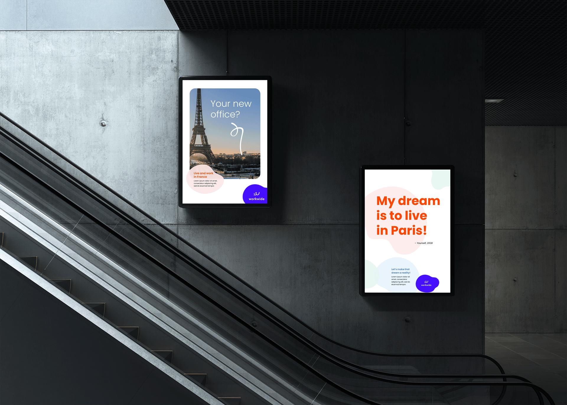
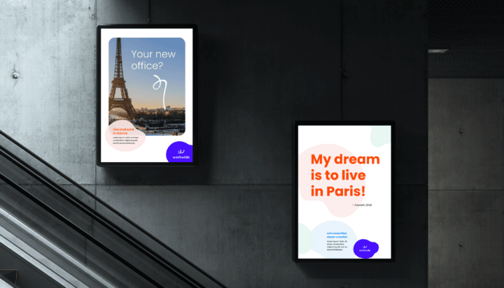
The visual identity deconstructed
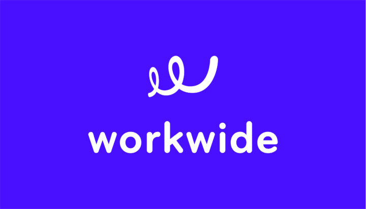
The new logo represents the humane and friendly aspect of the brand by using a rounded sans serif for its typeface and a forward-moving curl for the logo mark. The logo mark embodies the excitement Workwide’s job seekers feel about having the opportunity to move and work abroad.
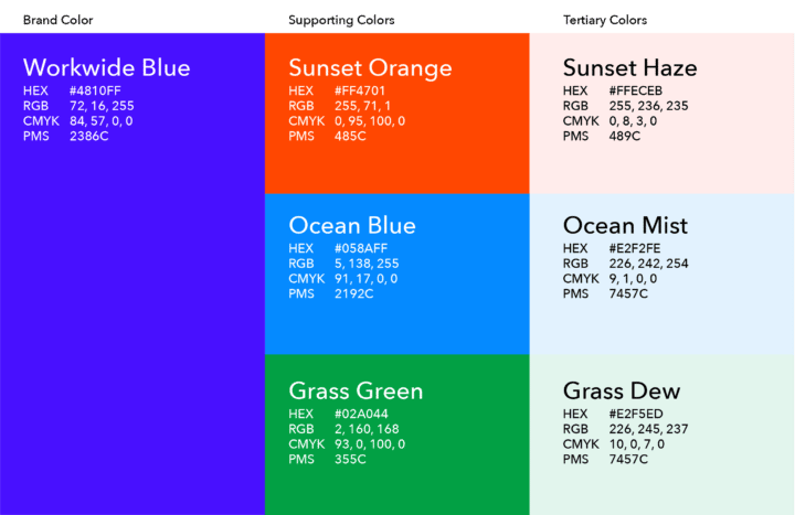
The new color palette, typography, and visual support elements embody Workwide’s friendliness. The color palette is bright and playful, and is inspired by the colorful cultures and nature around the globe.
The brand typeface is Poppins, which is a modern and clean san serif that can accommodate many languages and has high readability. The visual support elements are playful rounded puddle shapes that can be used in a variety of different ways to create dynamic compositions.
The digital presence
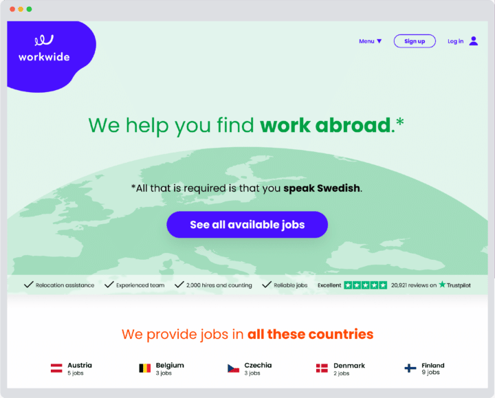
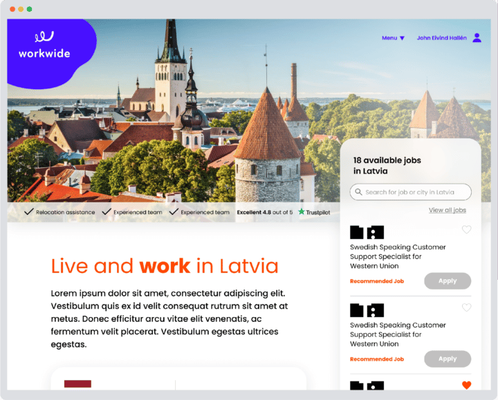
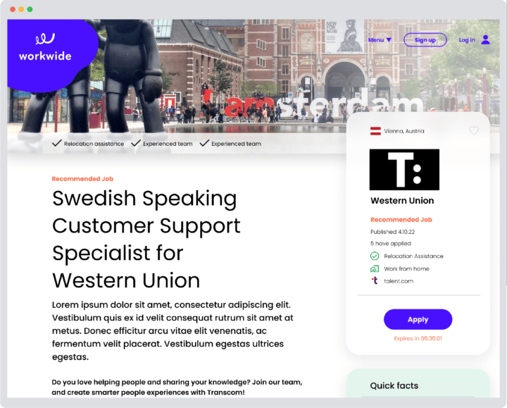
Once the new identity was created, it needed to be implemented across all of the localized sites in the same way. The design strategy developed included only one master brand identity with no variations between local sites. This was to maintain a very clear, cohesive, and consistent brand that would create recognition among the core audience regardless of where you would enter the site and what part of the world you are searching in.
Along with implementing the new identity, the web structure and user experience were also examined, and a new web design was created based on concrete CRO improvements.
The brand architecture
As part of the final delivery, Workwide needed to consider their daughter brand Lingocruit, recruitment agency, in the design rebrand. To maintain cohesion and fall in line with the strategy, Lingocruit was renamed to Workwide Recruit and The Brand Project design team decided to keep the same logo mark as Workwide, but adapt it to the original Lingocruit color palette.
What’s next for Workwide?
Going forward, the Workwide Group will implement the new visual identity across all of the Workwide localized sites and Workwide Recruit. The new identity was designed to create a better user experience for job seekers looking to live and work abroad as well communicate Workwide’s core values and increase conversion rates.
We’re excited for them to launch the new identity planned on a rolling basis per local site in early 2023. Stay tuned and keep an eye out for Workwide! They are one to watch.